Interface Concepts
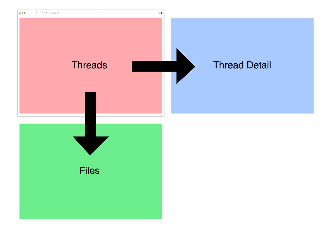
The Nylas Mail user interface is conceptually organized into Sheets. Each Sheet represents a window of content. For example, the Threads sheet lies at the heart of the application. When the user chooses the "Files" tab, a separate Files sheet is displayed in place of Threads. When the user clicks a thread in single panel mode, a Thread sheet is pushed on to the workspace and appears after a brief transition.
The {WorkspaceStore} maintains the state of the application's workspace and the stack of sheets currently being displayed. Your packages can declare "root" sheets which are listed in the app's main sidebar, or push custom sheets on top of sheets to display data.
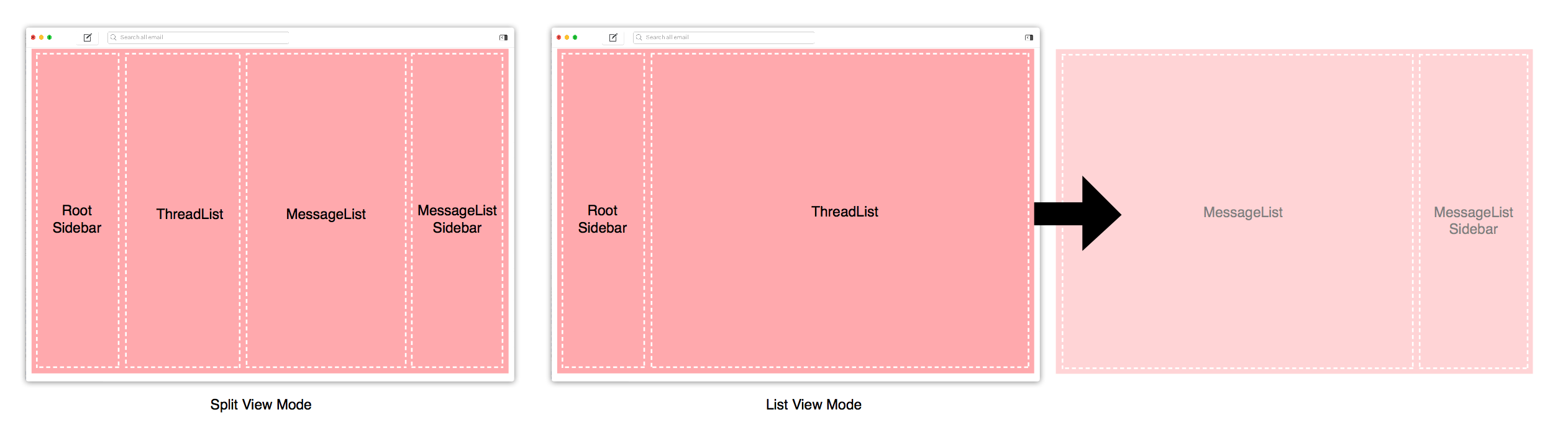
The Nylas Workspace supports two display modes: split and list. Each Sheet describes its appearance in each of the view modes it supports. For example, the Threads sheet describes a three column split view and a single column list view. Other sheets, like Files register for only one mode, and the user's mode preference is ignored.
For each mode, Sheets register a set of column names.
@defineSheet 'Threads', {root: true},
   split: ['RootSidebar', 'ThreadList', 'MessageList', 'MessageListSidebar']
   list: ['RootSidebar', 'ThreadList']
Column names are important. Once you've registered a sheet, your package (and other packages) register React components that appear in each column.
Sheets also have a Header and Footer region that spans all of their content columns. You can register components to appear in these regions to display notifications, add bars beneath the toolbar, etc.
ComponentRegistry.register AccountSidebar,
  location: WorkspaceStore.Location.RootSidebar


ComponentRegistry.register NotificationsStickyBar,
  location: WorkspaceStore.Sheet.Threads.Header
Each column is laid out as a CSS Flexbox, making them extremely flexible. For more about layout using Flexbox, see Working with Flexbox.
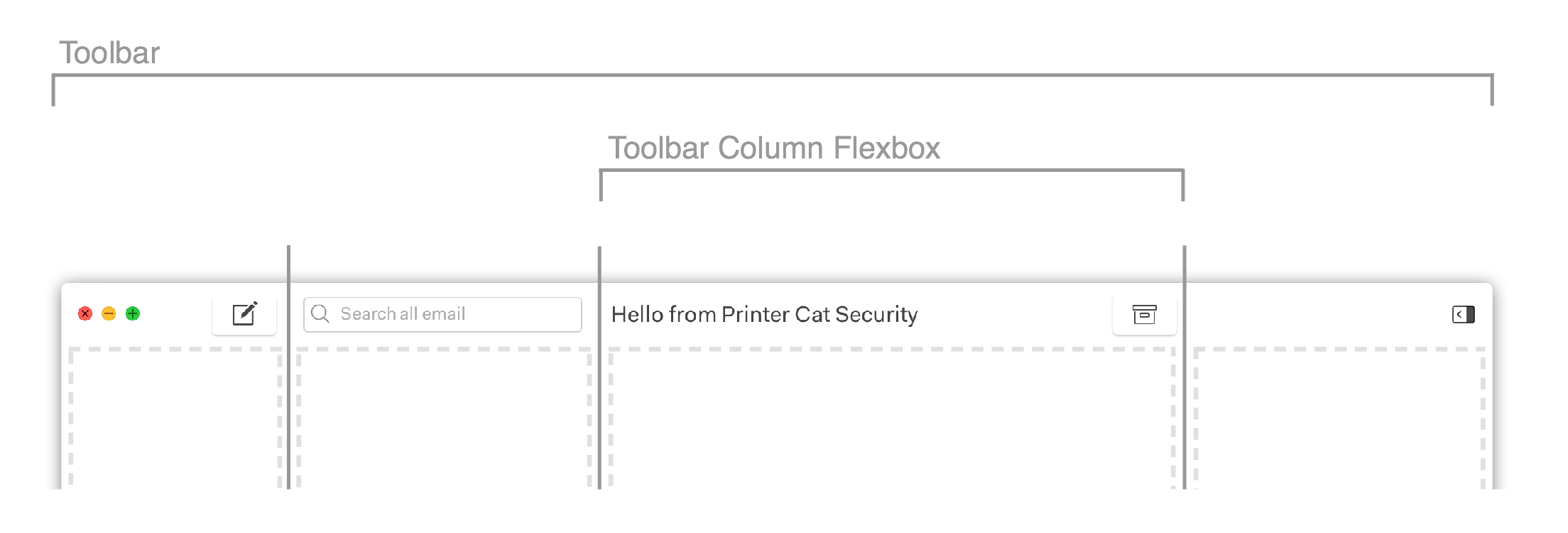
Toolbars
Toolbars in Nylas Mail are also powered by the {ComponentRegistry}. Though toolbars appear to be a single unit at the top of a sheet, they are divided into columns with the same widths as the columns in the sheet beneath them.
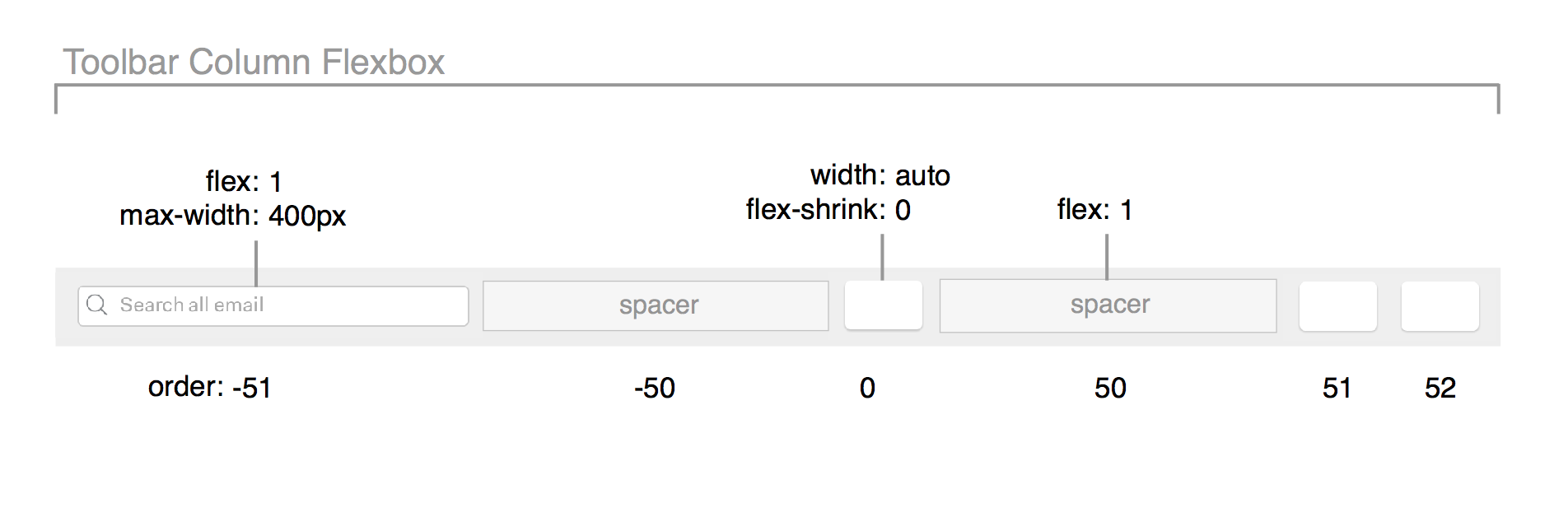
Each Toolbar column is laid out using {Flexbox}. You can control where toolbar elements appear within the column using the CSS order attribute. To make it easy to position toolbar items on the left, right, or center of a column, we've added two "spacer" elements with order:50 and order:-50 that evenly use up available space. Other CSS attributes allow you to control whether your items shrink or expand as the column's size changes.
To add items to a toolbar, you inject them via the {ComponentRegistry}. There are several ways of describing the location of a toolbar component which are useful in different scenarios:
<Location>.Toolbar: This component will always appear in the toolbar above the column named<Location>.(Example: Compose button which appears above the Left Sidebar column, regardless of what else is there.)
<ComponentName>.Toolbar: This component will appear in the toolbar above<ComponentName>.(Example: Archive button that should always be coupled with the MessageList component, placed anywhere a MessageList component is placed.)
Global.Toolbar.Left: This component will always be added to the leftmost column of the toolbar.(Example: Window Controls)